

01

Vicino AI

a canvas built from the ground up

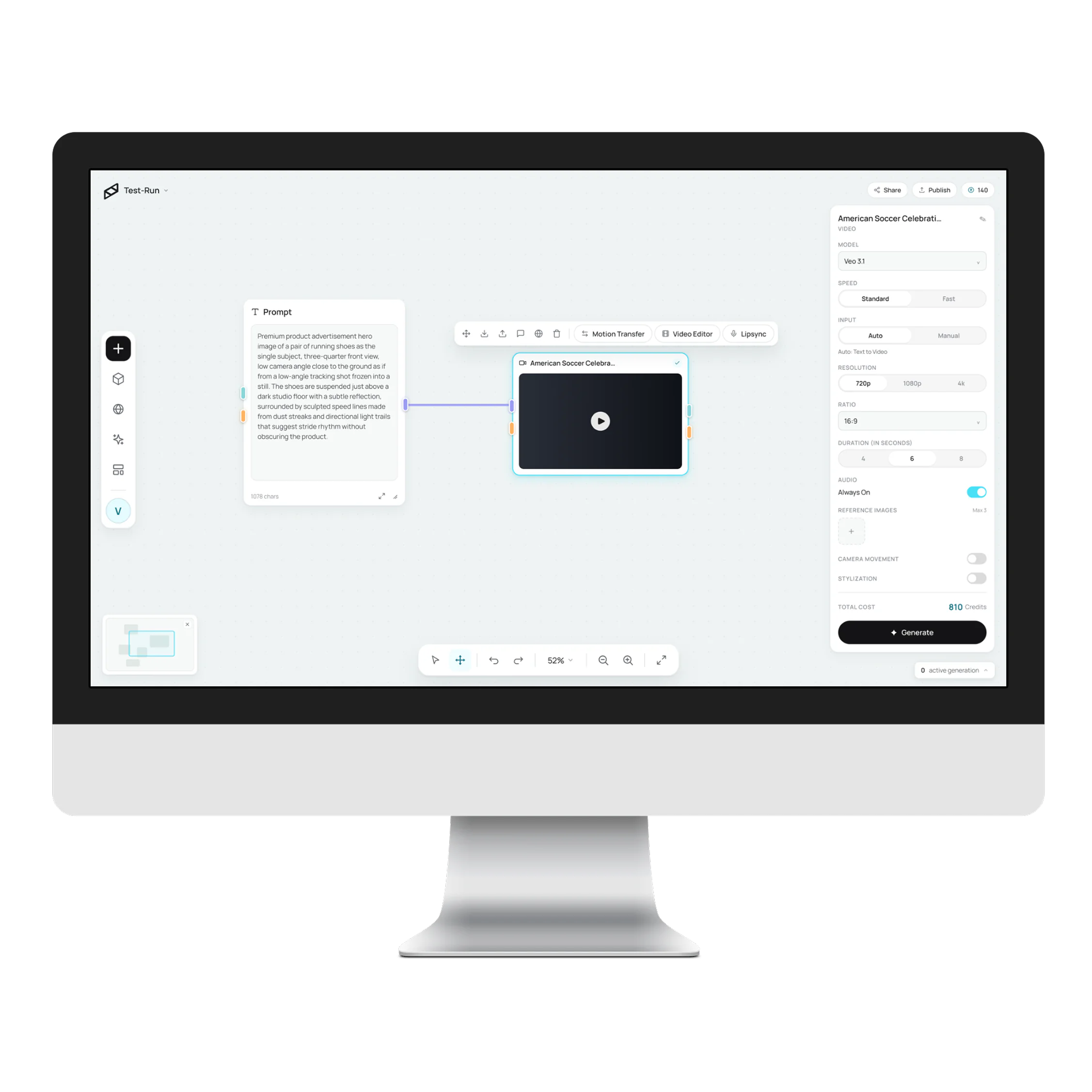
Vicino AI turns a marketing brief into a workflow you can see — an infinite canvas where every node is a generation step: image, video, 3D.

I helped build Canvas from the ground up, plus the design system behind Pulse and the guide that teaches AI to design inside it.
role
UX Engineer Intern
timeline
2026 → now
stack
Figma · React 19 · xyflow
place
Bellevue, WA
try the working canvas
Canvas, Vicino AI's node editor, on a studio display
02

Canvas, live

the real thing, in your hands

The shipped board, rebuilt at full fidelity — same chrome, same tokens, no backend. It sits here already run: the clip looping, the mesh turning. Click it and it opens full-window, yours to run and rewire.

scroll pans · ⌘ zooms toward the cursor lassos select on release drag inside the box moves the family esc always releases
text image video 3D four of the seven port types — the wires themselves run the redesign's soft purple
03

Canvas

a board where AI tools become nodes

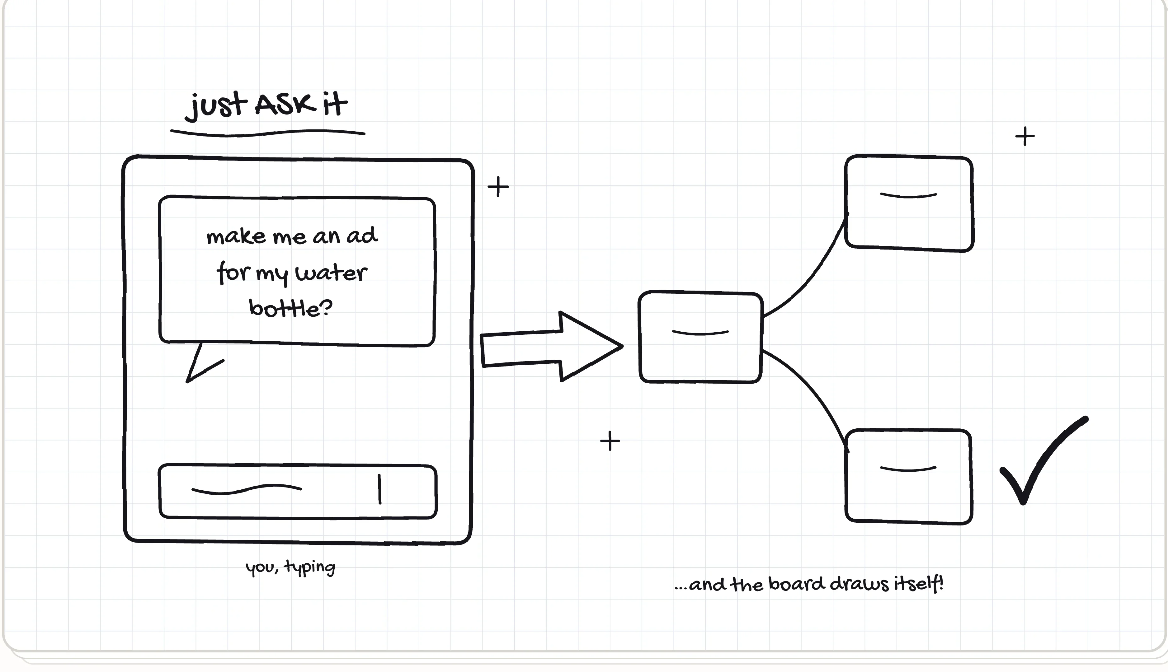
Every tool is a node — image, video, 3D, audio — but the idea was mapped in a sketchbook first: three sheets, one per use case, drawn before the editor had a single pixel. Flip the tabs.
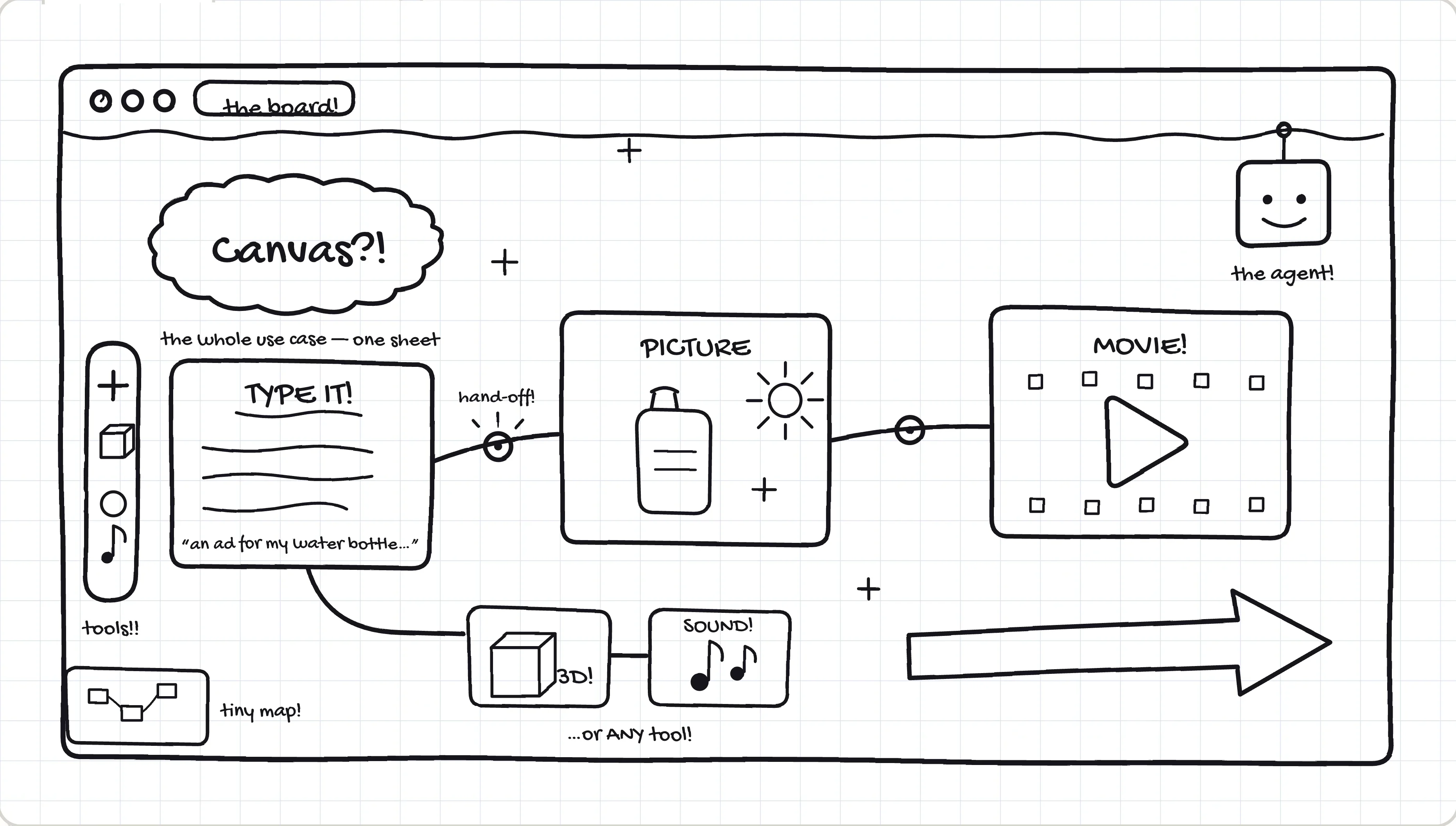
Hand-drawn use-case map of Canvas on graph paper: a cloud labelled 'Canvas?!', a prompt box reading 'type it' wired through hand-off dots to a 'picture' box with a bottle doodle and on to a 'movie' box, branches to small 3D and sound boxes, a tool rail and tiny minimap on the left, a little robot agent in the corner, and a big arrow captioned 'describe, wire, campaign'
Sketch of the first use case, 'just ASK it': a chat panel saying 'make me an ad for my bottle?', a big arrow to a small node board that draws itself, and a check mark
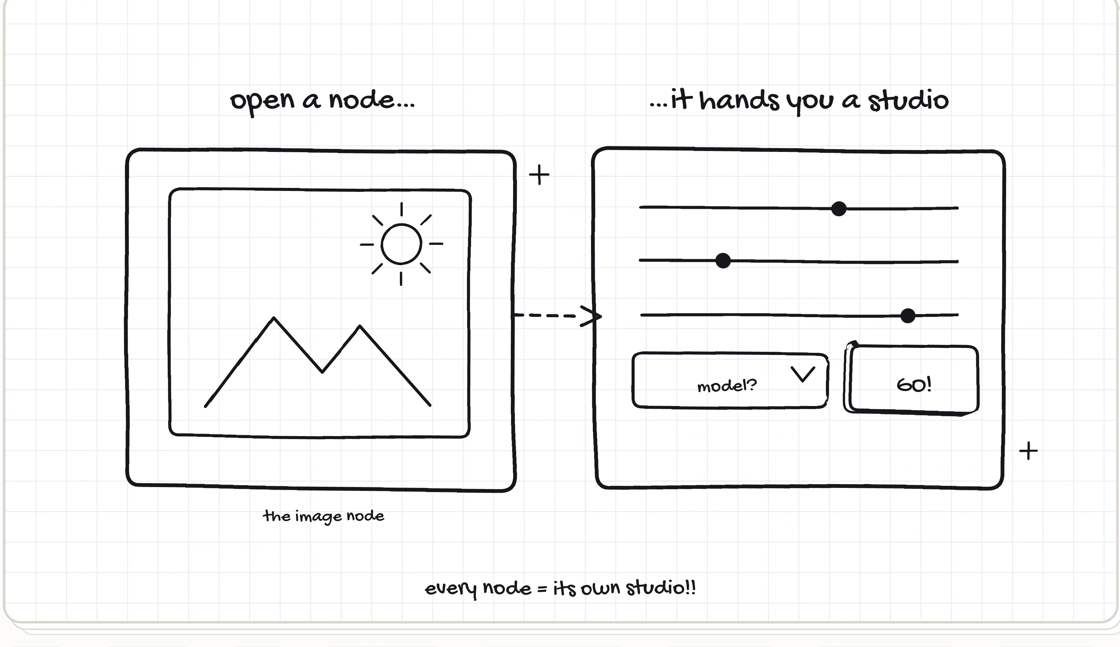
Sketch of the second use case, 'open a node, it hands you a studio': an image node card with a landscape doodle, a dashed wire to a panel of sliders, a 'model?' dropdown and a GO button, captioned 'every node = its own studio'
Image Video 3D Model Audio Text / Prompt Sketch to Image Image Editor Shooting Studio Storyboard 3D Refine Multi-View Video Merge Lipsync Motion Transfer Image Video 3D Model Audio Text / Prompt Sketch to Image Image Editor Shooting Studio Storyboard 3D Refine Multi-View Video Merge Lipsync Motion Transfer
04

Two ways to build

describe it, or wire it

Same board, two hands on it. Tell the agent what you want and watch the graph assemble — or place every node and pull every wire yourself. Most real work is both.

05

Anatomy of a node

one card, read closely

Every node is the same small promise: inputs on the left, the work in the middle, an output on the right. Learn this card and you’ve read them all — it introduces itself, one part at a time.

the header names the verb

Image, Video, 3D, Audio — one card, one job, stated in a word. A finished node earns its green check, so a glance across the board tells you what’s done and what’s still owed.

the ports are colored by what they carry

Purple is text, teal is image, apricot is video, blue is 3D. This card takes two inputs — a prompt and a reference picture — and you can read that from across the room.

the well is the work

Results land full-bleed in the card itself — no preview button, no popup. Drop media straight in, or let a wire deliver it from the node upstream; either way, the picture is the interface.

the model is a visible choice

flux-2-pro sits on the face of the card, never buried in settings. Select the node and its studio opens — models, ratios, credits — but the choice that matters stays printed where you can question it.

run lives on the node

Press play here, not in some global toolbar. Progress paints a quiet bar right under the work — exactly where you’re already looking — and the price of the run is quoted before you spend it.

the output hands it on

Whatever this card makes becomes the next card’s input the moment a wire leaves this port. That’s the whole grammar of Canvas: small promises, chained until they’re a pipeline.

06

System

the design language behind Pulse

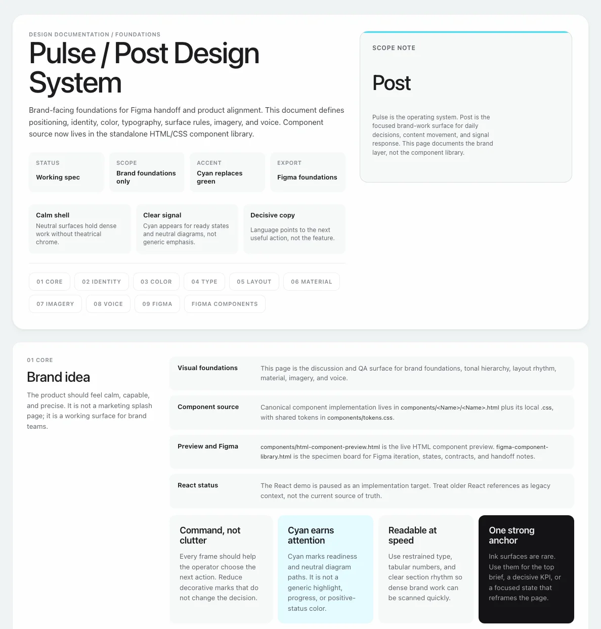
With my colleagues, I helped create the design system behind Pulse — Vicino's marketing-analytics side. 356 tokens in one truth-source file, and a brand book that ships as a website, because the best handoff is the real thing.

command, not clutter cyan earns attention readable at speed one strong anchor

the palette, straight from tokens.css

vicino-ds / brand.html The design-system brand book
07

Decisions, shown

how the language got chosen

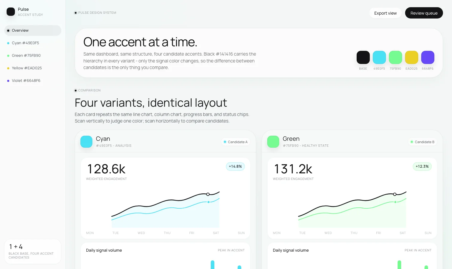
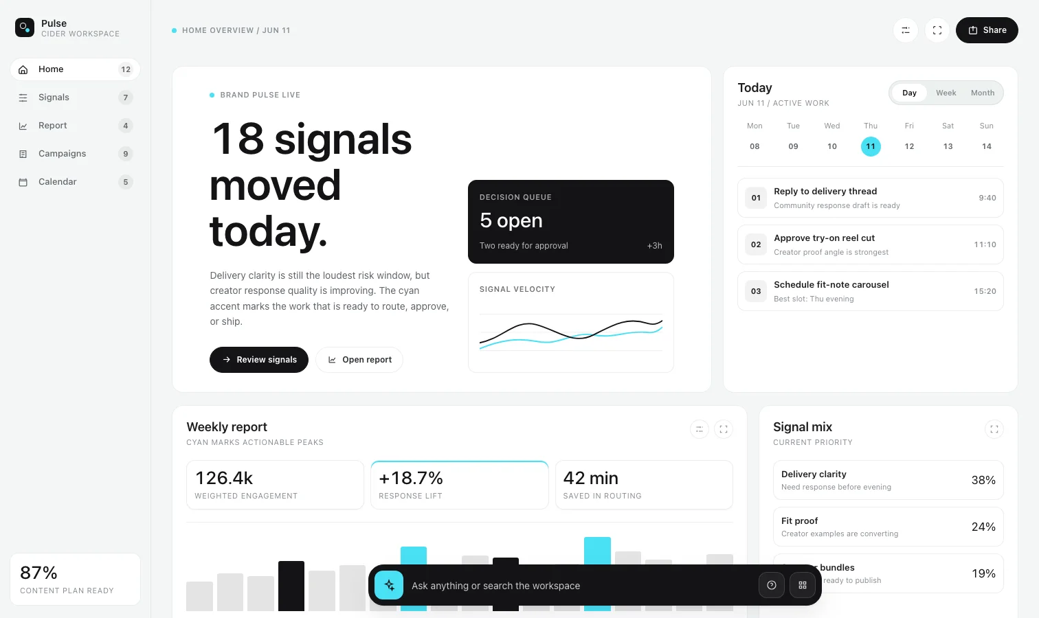
Design systems are arguments settled with evidence: four candidate accents on identical dashboards — cyan won — and one whole screen pushed to the edge of too much cyan. Both are the real files.

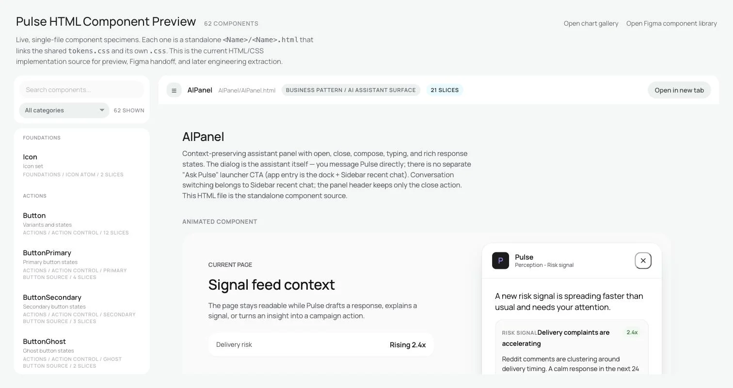
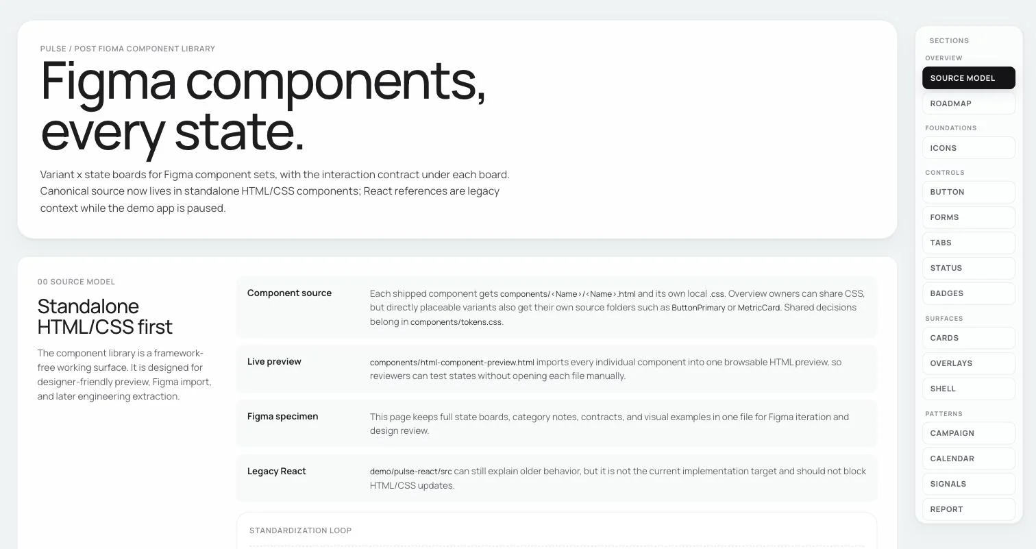
tokens.css 356 tokens · one file 62 components HTML + CSS pairs live preview the browsable library Figma board specimens, every state drift is caught in CI — a verify script walks the circle
08

Components

62 components, one truth source

62 components, each a plain HTML/CSS pair behind the same 356 tokens, drift-checked in CI. Every card below opens the real file in its own tab.

09

The AI guide

a design system machines can read

A design system starts to drift the moment a machine starts drawing. So we wrote the system down as a generation contract — a skill an AI agent loads before it touches a screen: reuse before inventing, one truth source, and a list of things it must never do.

I helped create the guide. The chips below are its forbidden list — turn them over; the card on the right is the real file.

design-system / ai-generation-guide.md
---
name: pulse-design-system
description: Generation contract for the
  Pulse/Post visual system. Load this
  whenever an AI agent generates a new
  Pulse screen, component variant, or
  React extraction, so output stays
  inside the existing design system
  instead of inventing a new dashboard
  style.
---

loaded by AI agents before they draw a single screen
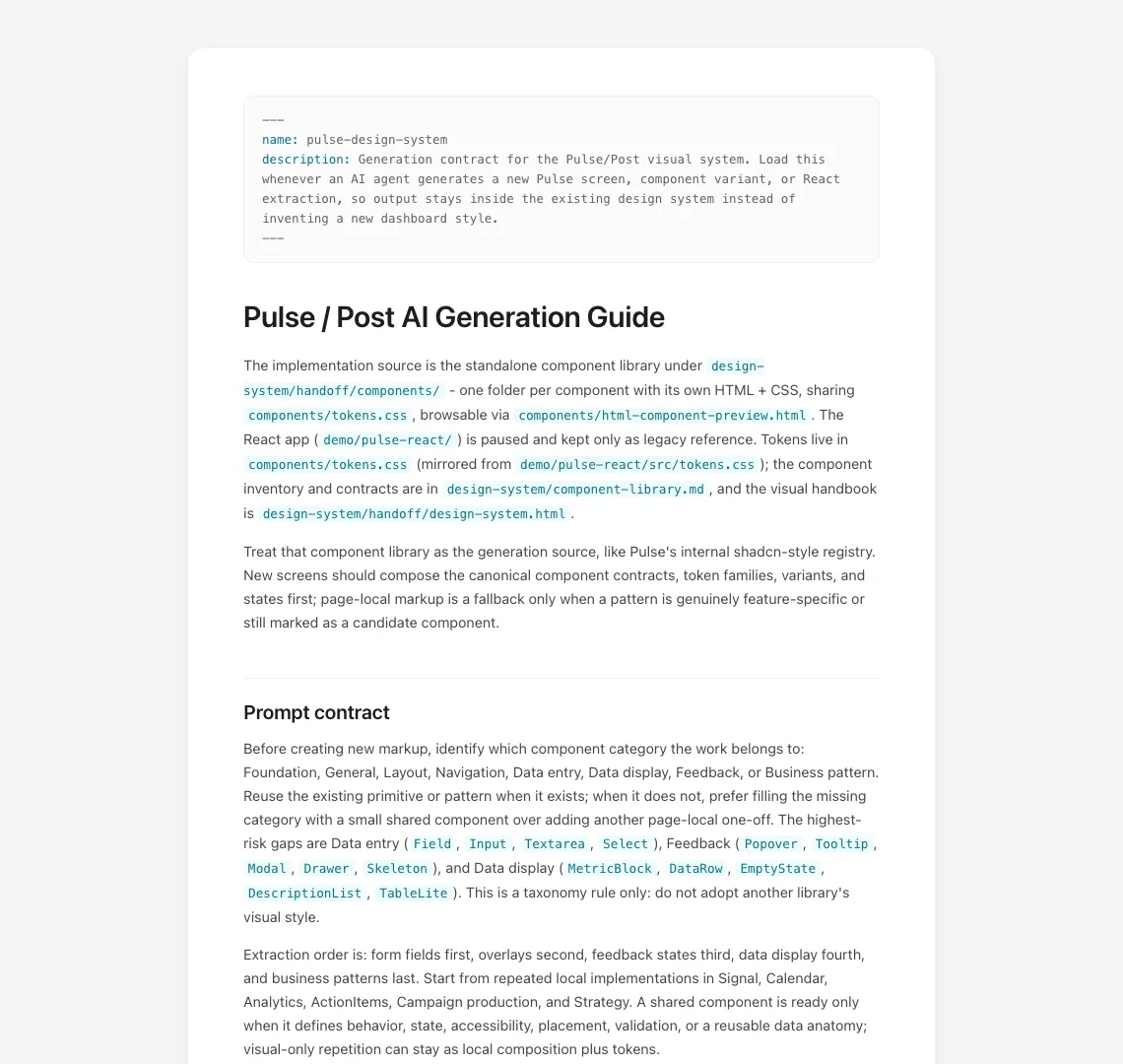
The AI generation guide rendered as a document
fail the output if

text clips · colors do not explain state · card shadows form square artifacts · nested cards appear · the user cannot tell the next action

10

The guide, at work

eighteen screens, redrawn on-system

The contract got its first big job: Pulse’s onboarding — eighteen screens, landing page to first Daily Report. I handed Claude Code the generation guide and the design system and let the machine do most of the drawing: every proposed screen built live from the real tokens, at a fraction of the usual cost.

what the review filed, on the Pulse severity ladder

11 blockers 47 friction 32 polish 90 findings in all

And the handoff is the real thing again: the review ships as a website — each screen as it ships today beside its proposed redesign, defect by defect. The card on the right is the live site.
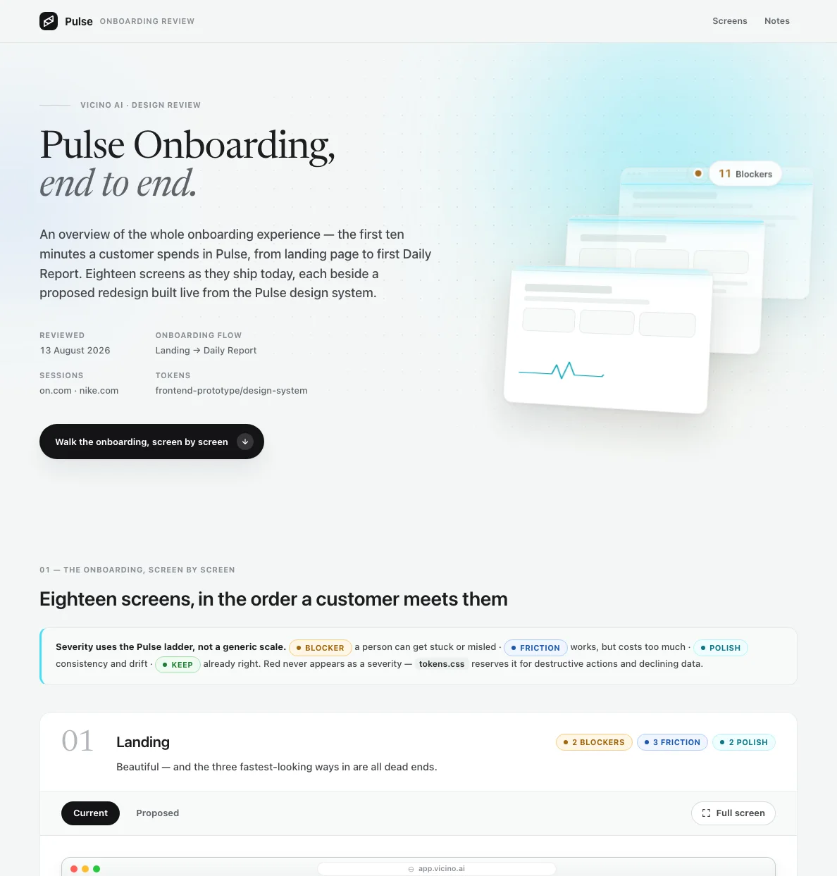
pulse-onboarding-design-review.vercel.app The Pulse onboarding design review: eighteen screens, each shown as it ships today beside its proposed redesign
11

Results

what shipped

24 node types

on Canvas — image, video, 3D, audio, and every tool between

62 components

in the design system, each a plain HTML/CSS pair with its states

356 tokens

in one truth-source file — drift shows up in CI, loud and yellow

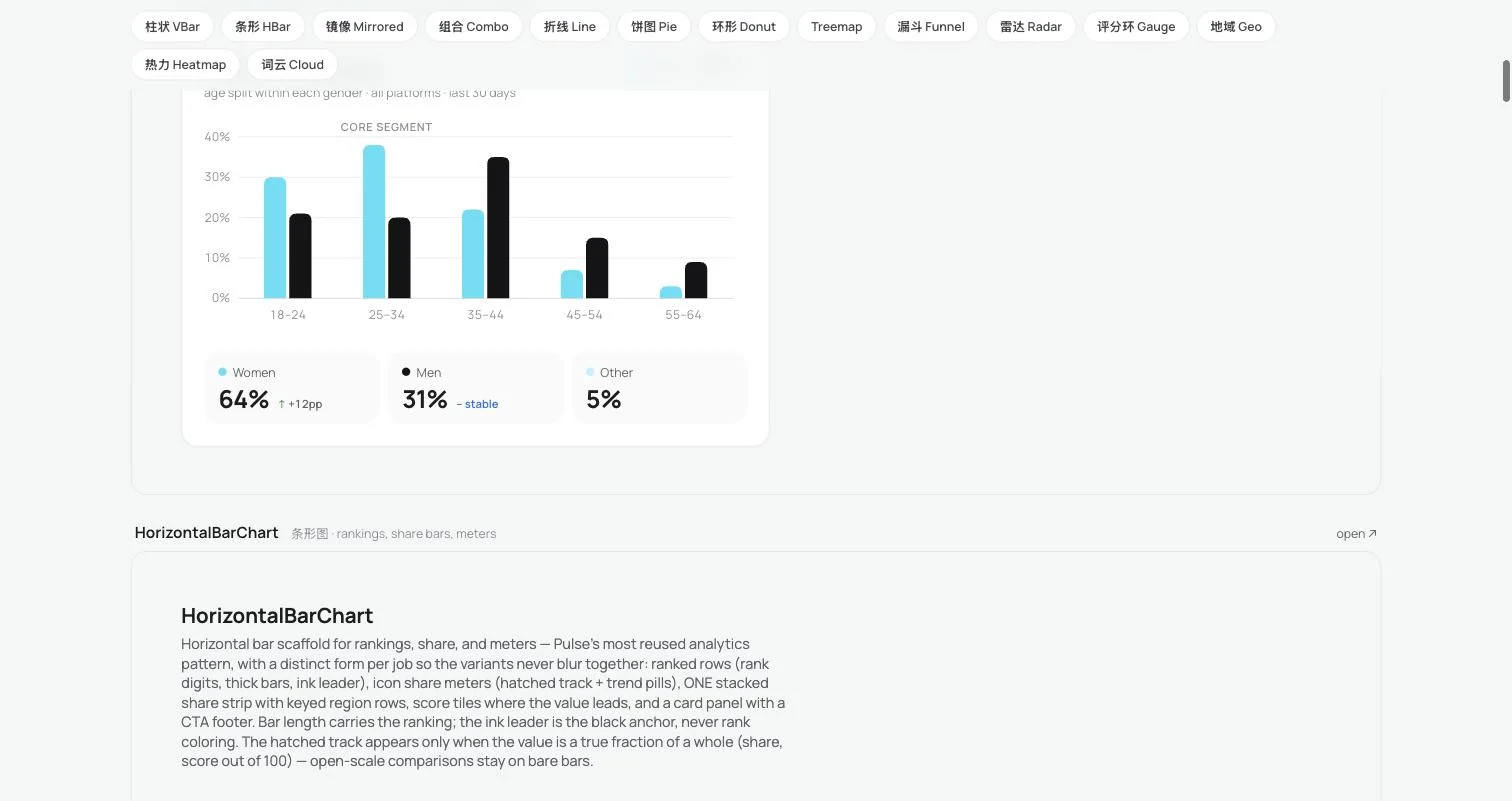
14 charts

one data-display family — mono-cyan and ink, honest by contract

18 screens

of onboarding redrawn on-system — the machine holding the guide

Build the thing first — Canvas taught us what the language needed.

Then build the language — tokens linked, never copied, turn drift into a design decision.

Then teach the machines — a system an AI can read is a system that holds.

Then hand them the pen — eighteen screens later, the system held.